Designing clean, conversion-focused visuals that support product understanding and elevate the brand’s digital presence.
A refined A+ system paired with thoughtful packaging stickers to create a cohesive experience across purchase touchpoints.
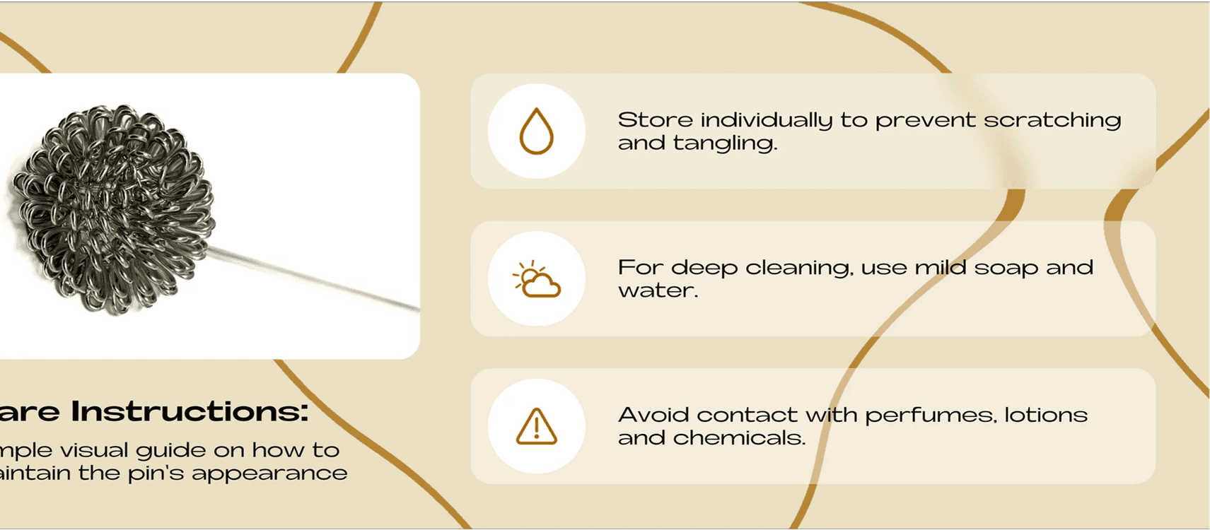
The A+ pages were designed to make product details instantly understandable. I created a structured information system with clean headers, focused descriptions, and premium product photography.
Each module was arranged to guide the buyer through benefits, usage, and comparisons without overwhelming them.The white-neutral palette and minimal layouts supported clarity and trust—two critical elements for e-commerce conversions. By aligning tone, hierarchy, and visual rhythm across all A+ modules, the brand gained a stronger digital identity and a more consistent shopping experience on Amazon.
Impact:
The A+ modules were reported to increase conversion rates by roughly 18% and strengthened visual consistency across product categories.


To complement the digital experience, I designed packaging stickers that elevate the unboxing moment. The stickers pair simple typography with clean brand elements, ensuring the first physical touchpoint feels considered and premium.
These stickers also help maintain visual consistency across packaging variations. The focus was on readability, warmth, and brand reinforcement. Whether used on everyday orders or gifting packs, the stickers created a cohesive, branded finish that strengthened customer recall and extended the Tie Hub identity from screen to doorstep.