Designing clear, premium catalogues that support both retail customers and corporate buyers.
A structured editorial system that balances lifestyle, product detail, and brand storytelling across two separate catalogues
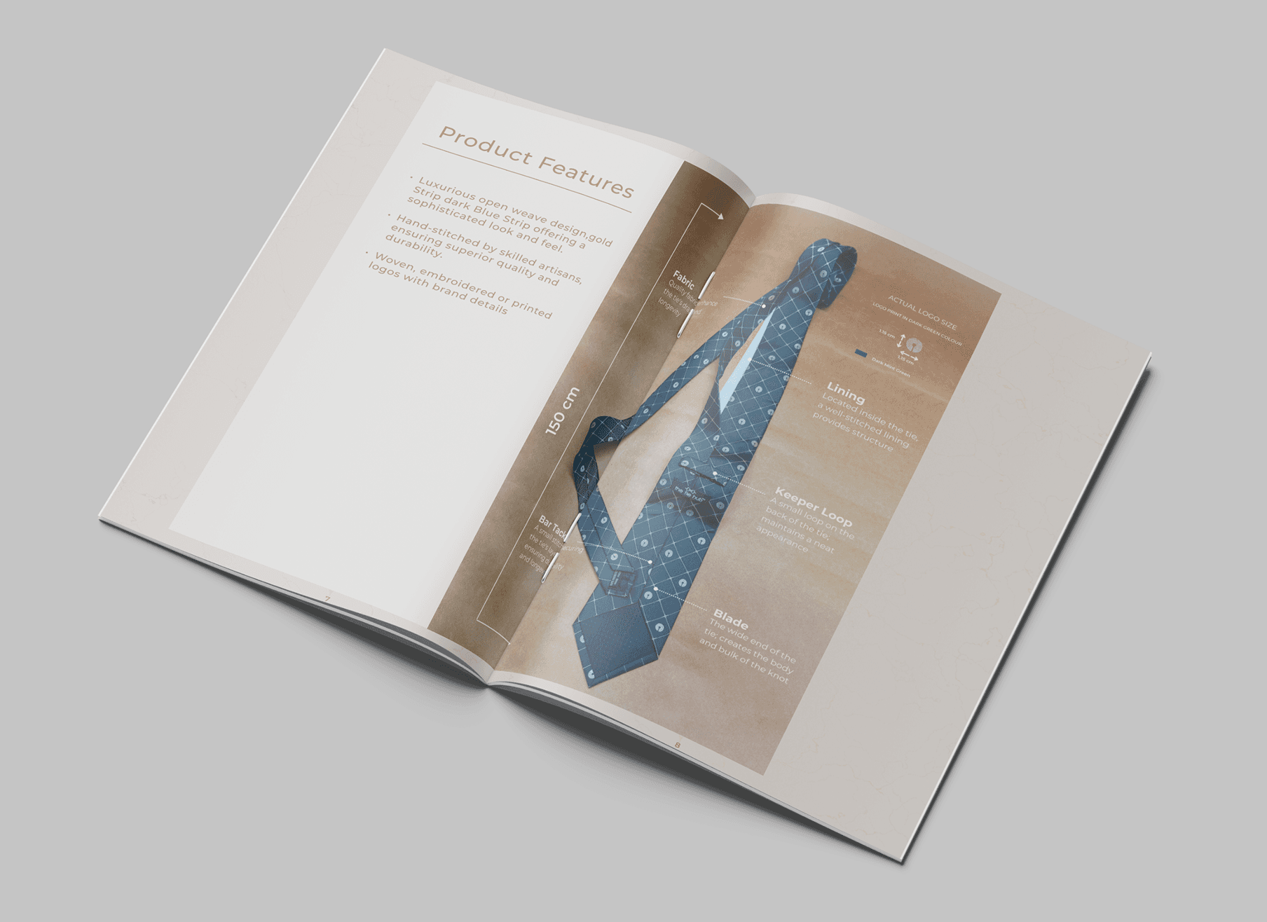
The Product Catalogue was designed to feel premium, modern, and effortless to browse. I created a clean editorial grid that balances lifestyle imagery with clear product sequencing.
The white-neutral palette, refined typography, and generous spacing helped elevate the accessories, giving each product the clarity it needed to stand out. The layout supports quick visual scanning—ideal for customers exploring styles, colours, and price ranges. Lifestyle visuals paired with product grids helped communicate the brand’s fashion-forward identity while maintaining simplicity.
IMPACT
The lookbook became a sales conversation tool that reportedly increased wholesale engagement by around 15% and positioned the apparel line as a natural extension of the brand’s luxury narrative.
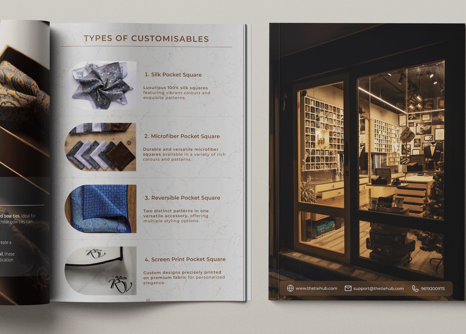
The Corporate Catalogue required a more structured, professional tone. I designed a clean, business-focused layout that presents bulk options, gifting sets, and partnership details with clear hierarchy.
The grid system supports logical flow, enabling corporate buyers to navigate offerings without friction. By simplifying information density, aligning typography with a more formal tone, and using curated product compositions, the catalogue became a strong tool for pitches and corporate presentations.
IMPACT
The Corporate Catalogue helped the marketing team streamline brand storytelling, reducing client presentation prep time by approximately 30% and supporting a 20% uplift in wholesale order inquiries. It became the visual foundation for subsequent seasonal catalogues.